
Doodles That Define This Present Time
Creating a 2020s-style illustrated graphic design


By Amy💕
Doodling the 1980s was fun. Nostalgia kicked in. I was delighted to remember Velcro wallets, family time around the TV, microwave popcorn, and the beginning of the speedy progression of technology.
Y2K—also fun. I remembered our first computer. I was newly married. My husband and I loved the dial-up sound and the words, “You’ve got mail.” We didn’t have kids yet, but by the year’s end, we’d have our first baby. And another, and another, and...
And then came 2020.
Maybe it’s because we’re still living it. Maybe my feelings about this era are raw.
Even those of us who yearn for long summer days playing in sprinklers and catching frogs have technology at our fingertips. We want to return to homesteading and walks in the woods, but we bring smartphones along. We take pictures, share the moment, and hope someone out there will connect. They do, and we’re thankful.
But we must admit—2020 is a full commitment to technology.
We are a mother-and-son illustration team. Our drawings are hand-drawn and traced in the computer. Our goal is to help Substackers illustrate their publications with fun and simple drawings. We’re trying to restore the human creativity that is being lost from the progression of technology and AI.
2020 Doodles
I made 2020 doodles, accepting the current state of things. I did not imagine how I wanted them to be, or how I think they should be, but how I think they are. There’s freedom in embracing reality.
My doodle design started with a smartphone. From rotary to cell to smart.
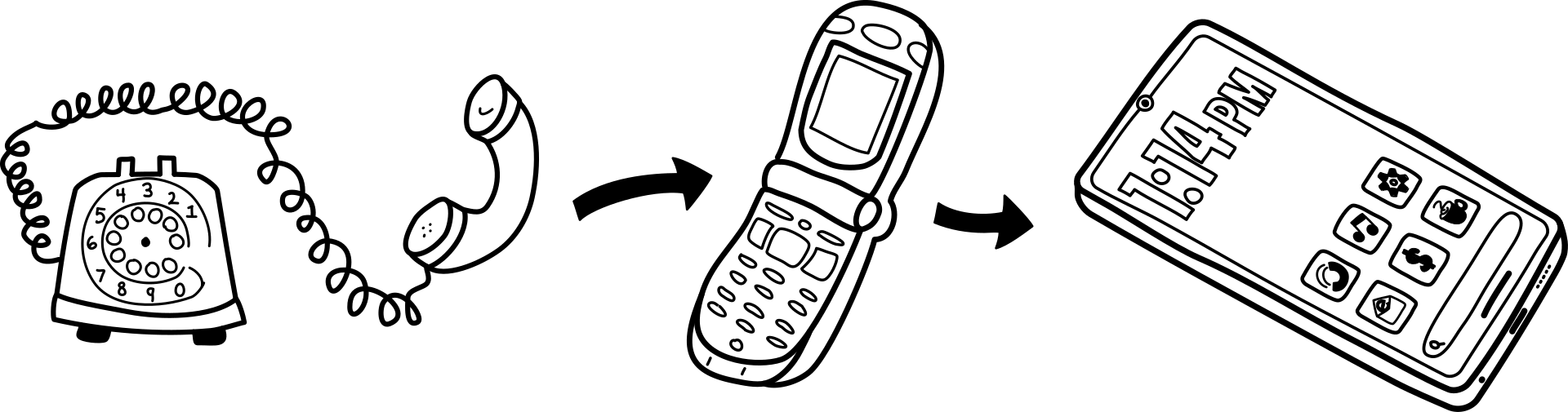
To create our 2020 design, we decided to magnify the smartphone.
With the smartphone amplified, the doodles were easy.
I drew icons for apps.
From cash and checkbooks to payment apps.
From cassette tapes to MP3 players to music apps.
From coffee makers to digital coffees. (Okay, maybe this technology stuff is fun after all.😊)

Finding Inspiration and Moodboarding
By Justin
If I type “80s graphic design” on Pinterest, I get a clear visual style. Sure, there are different design directions we could take with an ‘80s aesthetic, but the styles are still very vivid. However, it wasn’t as easy determining a clear style for the 2020s.
It’s harder to detect trends and popular styles while we are living in the moment. As time goes by, each era becomes more recognizable and distinct from the others.
That being said, I had a good idea of where I wanted to take this project. I put together a moodboard highlighting the visual direction and mood of the design.
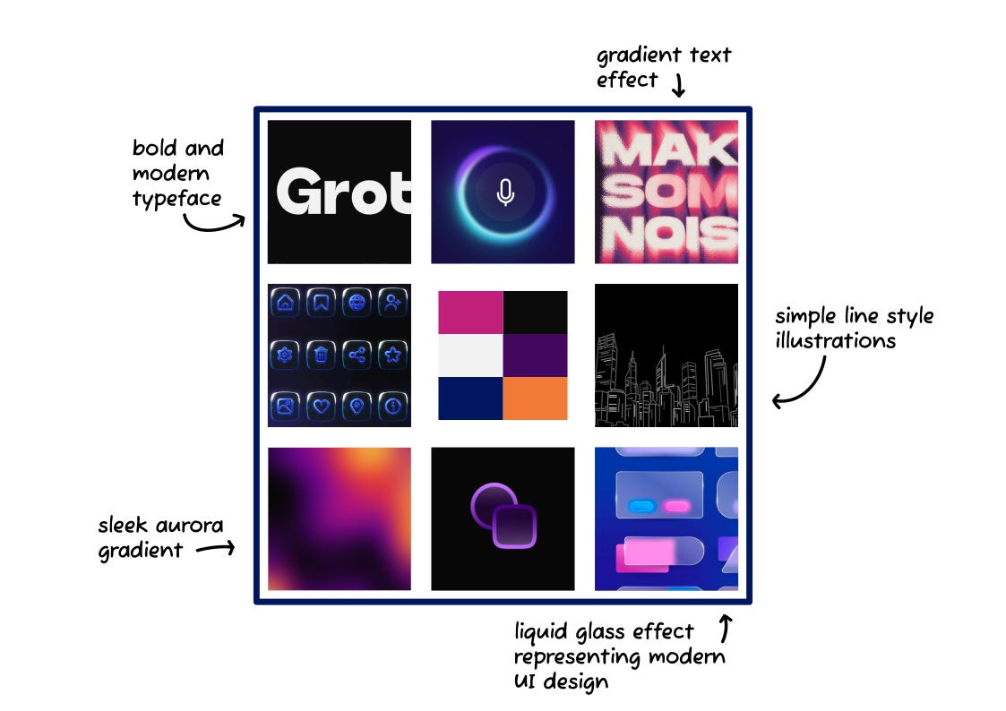
Let’s talk about the moodboard… I wanted a clean yet bulky sans serif font.
I also wanted to implement an aurora gradient. A gradient is a blur of colors. An aurora gradient has a flowing pattern similar to the Northern Lights. These gradients are often used in AI web/UI (user interface) design, so they feel modern.
With the visual direction set, it was time to move on to the design.
Typography
First things first, I chose a background color and the fonts.
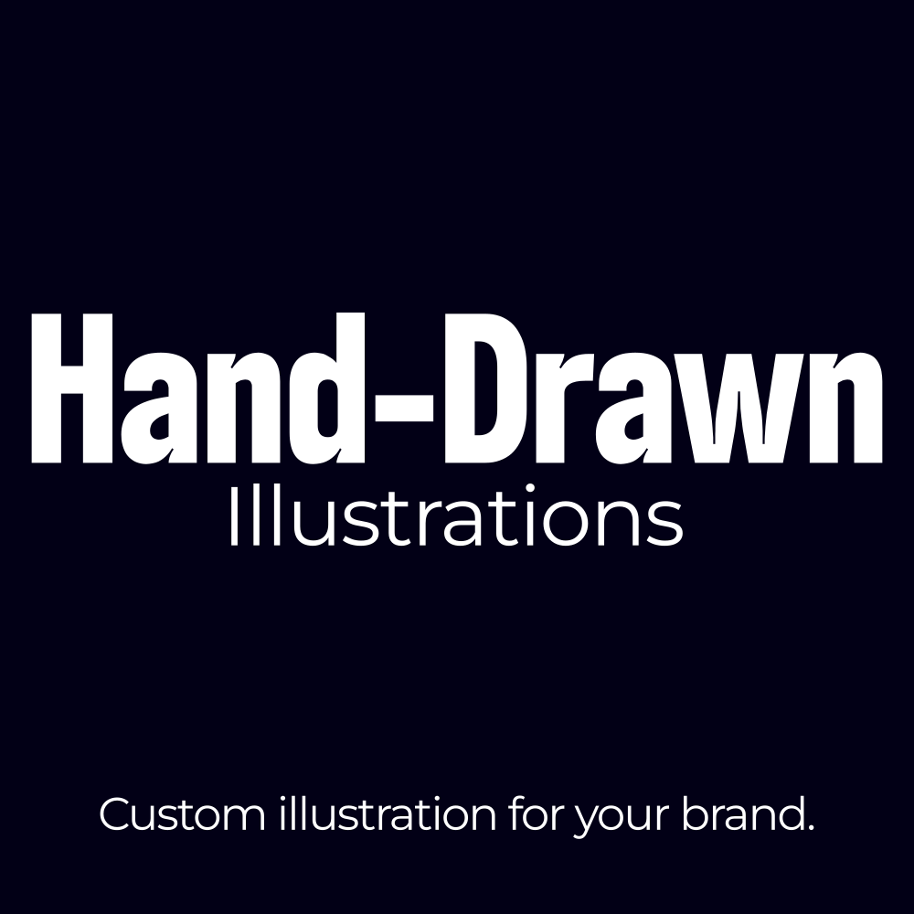
The “Hand-Drawn” font is Boldonse. I paired this tall, thin font with a popular typeface that is much wider, Montserrat.
These two fonts work great together and gave the design the clean modern look I was going for.
Colors
Using the orange and pink from the moodboard, I created a gradient for the background. I then used a similar gradient for “Illustrations” and “your brand.” This helped those words stand out, as they are key to the message.
“Hand-Drawn” has a glow and a gradient, fading the color out towards the top of the lettering.
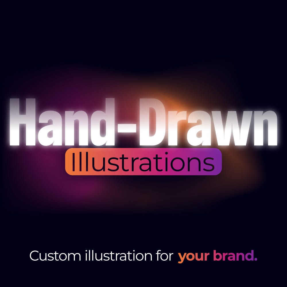
After creating this concept, I preceded to spend hours playing with multiple other ideas before coming back to this design. 😒 Oh well, at least I proved those other ideas weren’t going to work.
Adding Illustrations
After tracing the sketches into the computer, I added them to the design.
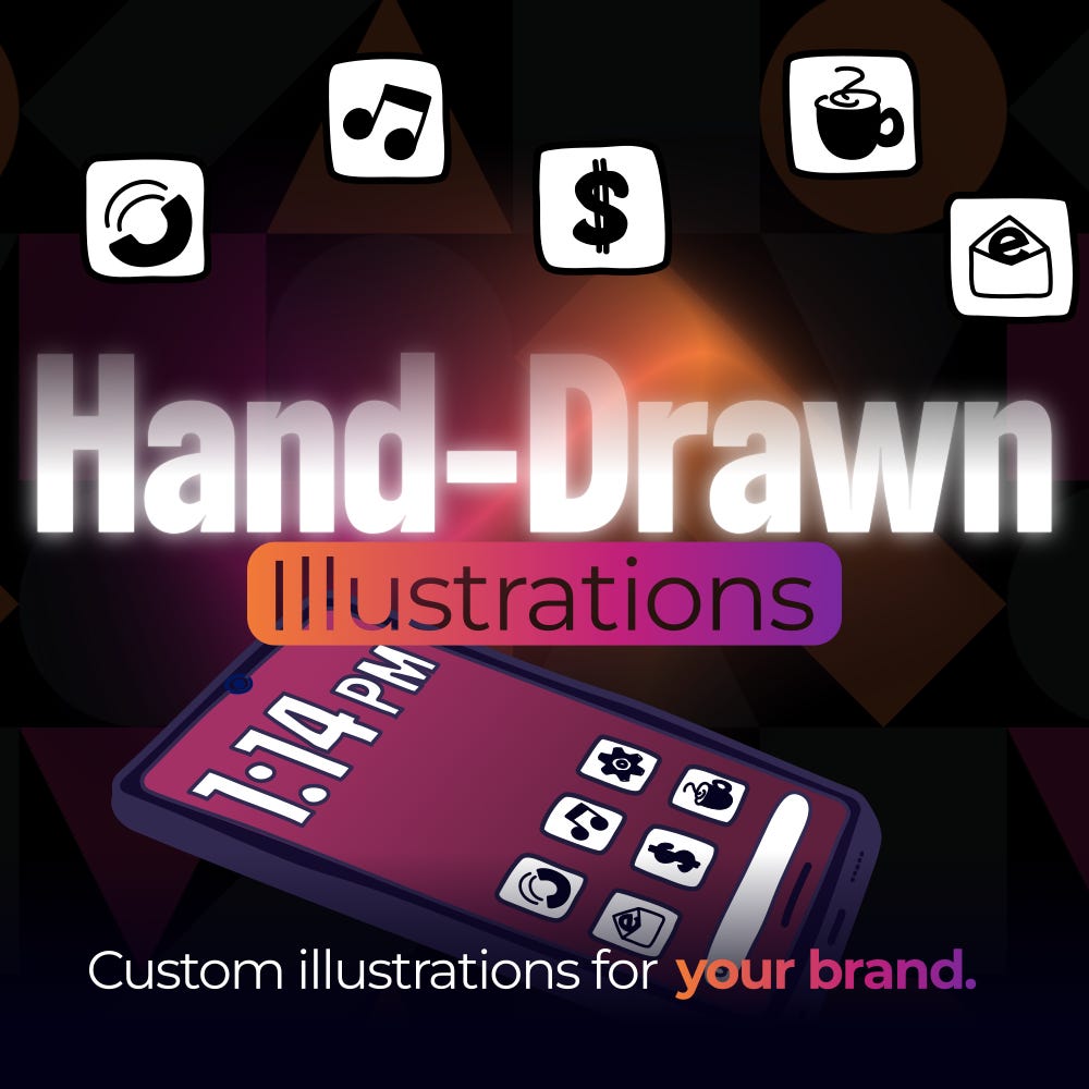
The idea was to have a smartphone with icons of the apps projecting from the phone and floating in the empty space.
I added some faint shapes in the background. Can you spot them? 🧐
At this point, I was really close to finishing the design.
The Finished Design
After adding lines connecting the icons to the phone, adjusting the colors, and altering how I implemented the shapes in the background, I was finished.
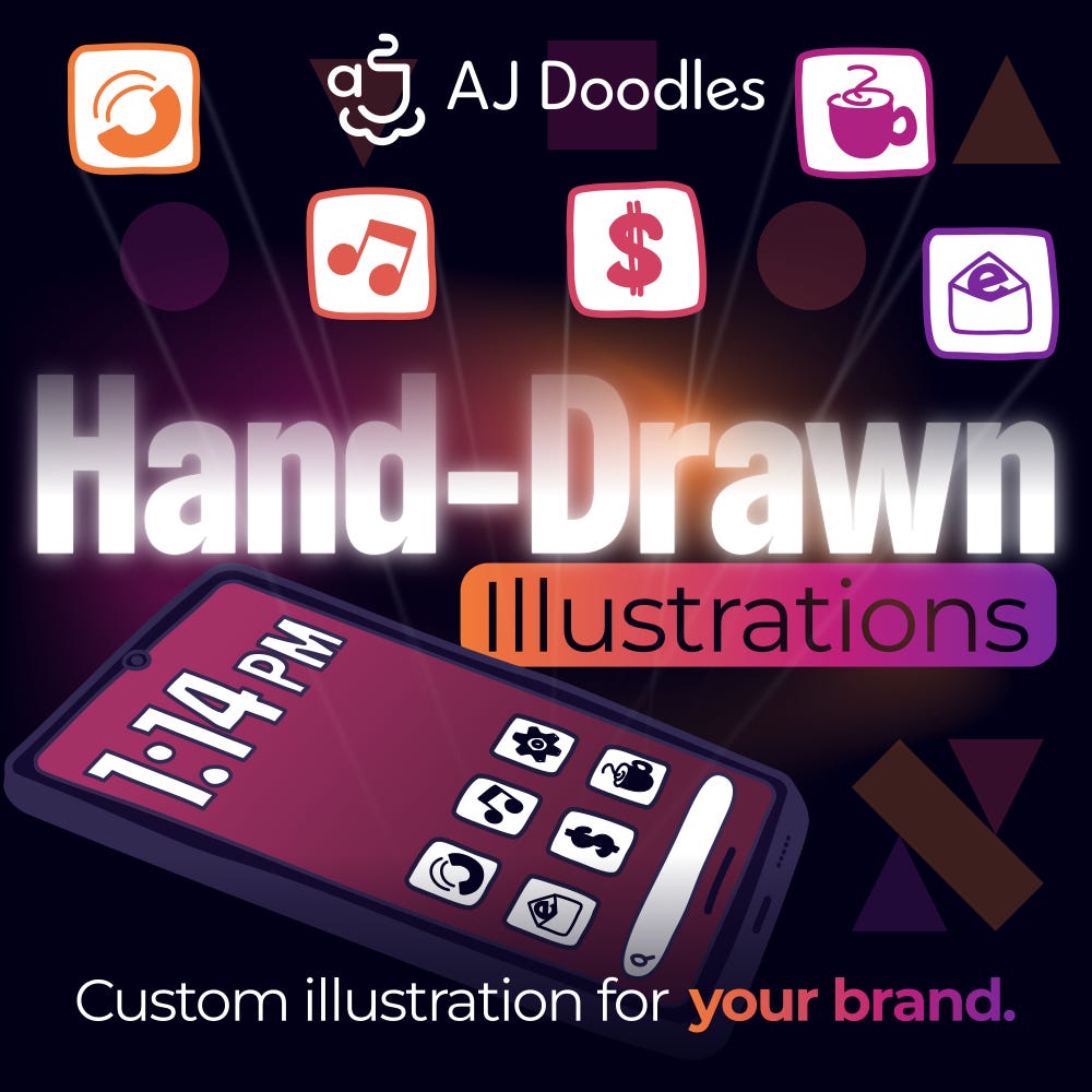
The result is a vibrant, modern design that feels very 2020s. At least it does to me. Additionally, it is sharp yet playful. We are all about playful here at AJ Doodles. 🙂
Here’s a peak inside the design document…
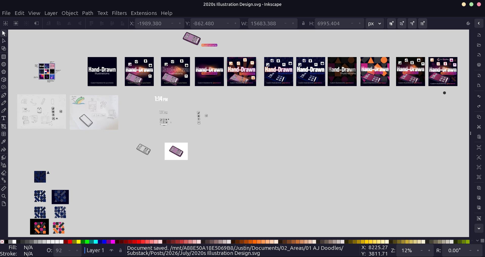
Yes, I took my time exploring multiple ideas. My design process includes making tiny alterations and comparing them to the previous concept. I take what I like and discard what doesn’t work for the finished design.
Hand-drawn Illustrations for Your Business
So, now it’s your turn to transform your visuals.
You too could have designs that articulate what you’re offering. After all, clarity increases conversion.
It’s time to make an impression! To stand out among millions of other creators.
Use illustrated designs to make a statement. A statement that is enticing. A statement that makes your viewers interested.
We are ready to help you optimize your branding with hand-drawn illustrations.

I hope you found this read helpful and interesting.
If you have any questions, comments, or remarks, drop them below in the comments.
I liked seeing your process. Thanks!