

Back to the 80s: Creating Retro Illustrations
Eighties-Style Graphic Design
I wrote a poem called “Back in the 80s.”
Back in the 80s
By Amy💕
If you remember…
Velcro wallets
Fanny Packs
Rotary Phones, tangled cords
Frog Flip Phones
And Phone Books
Swatch Watches,
Jelly Bracelets, Jelly Shoes
High-top Converse All-stars
Terry Cloth Sweat Bands
And Leg Warmers
Polaroid Cameras
Kodak Disks
Sony Walkman
Cassette Tapes, Personalized Mixes
And Boom Boxes
Atari
Pac-Man, Donkey Kong, Pitfall
Cheers
The Cosby Show, Family Ties, Knight Rider
And waaay  too much TV
Mr. Coffee
Pudding Pops
Fun Dip, Nerds
Chuckles, Big League Chew
And Styrofoam McDonald’s Packaging
Drinking Water from the tap
Back to the Future
In the Theater
Popcorn and Soda
All under 5 dollars
Brown Paper Bags
Brown Paper Textbook Covers
Scratch ‘n Sniff Stickers
Trapper Keepers
And Fuzzy Pencils
Encyclopedias
Newspapers, the Funnies
Schwinn Bikes, BMX Bikes
Skateboards
And scrapped knees
Punch Buggies
Station Wagons
Riding in the back of pick-ups
Without seat belts
And Fuzzy Dice
Then you probably grew up back in the 80s.
And you lived to tell about it.
Retro Illustration Challenge
By Justin
As a designer, I love seeing designs from different time periods: trends that mark each decade, colors that feel retro and nostalgic, and typography that spells out an era.
As time goes by, design has changed a lot.
I had the idea to create illustrated designs to represent three different time periods.
Starting with the ‘80s, then moving to Y2K, and finishing in the 2020s, I wanted to create three ads for our Custom Illustrations service.
In the next three weeks, we will explore the impact of time and culture on design trends over these 40+ years.
This will be a fun, yet challenging, project. So, let’s get into it.
We are a mother-and-son illustration team. Our drawings are hand-drawn and traced in the computer. Our goal is to help Substackers illustrate their publications with fun and simple drawings. We’re trying to restore the human creativity that is being lost from the progression of technology and AI.
Finding Inspiration and Moodboarding
When someone sees the design, I want them to say, “Yep! That’s the 80s.” To make this impression, I did a lot of research.
As with any time period, there were several different directions I could have taken with my 80s design—neon and electric colors, an old-style serif editorial look, paper cutout collage with mixed media, just to name a few.
After many web and Pinterest searches, I put together a moodboard. Moodboards showcase sample designs, giving clarity to the tone and style of a project.
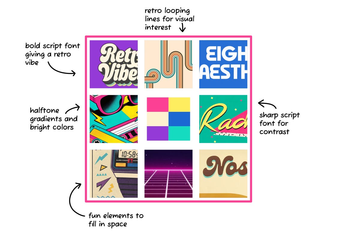
In the center of the moodboard, I created a color palette. The colors were not set in stone. They served as an example of the direction I wanted to take.
When my research was complete, my mom drew up some 80s doodles.
80s Doodles
By Amy💕
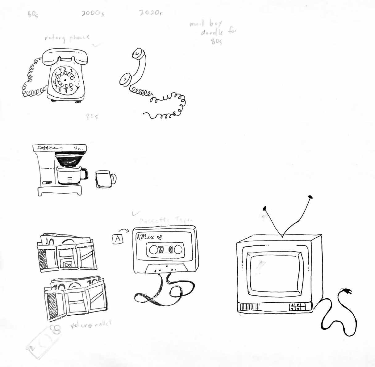
Knowing that we were planning to do ads for the 80s, Y2K, and 2020s. I chose items that changed over time.
For example, I doodled some coffee makers.
As a kid, I remember my parents purchasing a Mr. Coffee. In the 2000s, when the Keurig single-serving coffee maker came out, my husband and I bought one (my parents did too). And now, in the 2020s, there’s an app for everything. My doodles reflected changes over time, changes that others could relate to as well.
The doodles that were used for this project were the rotary phone, Mr. Coffee, a Velcro wallet, a cassette tape, and, of course, a television. Life in the 80s seemed to revolve around the television.
Building the Design
By Justin
Similar to building a house, I start every design by laying the foundation. In this case, the core elements were the text. I wrote out the copy that was used in each design for the different time periods.
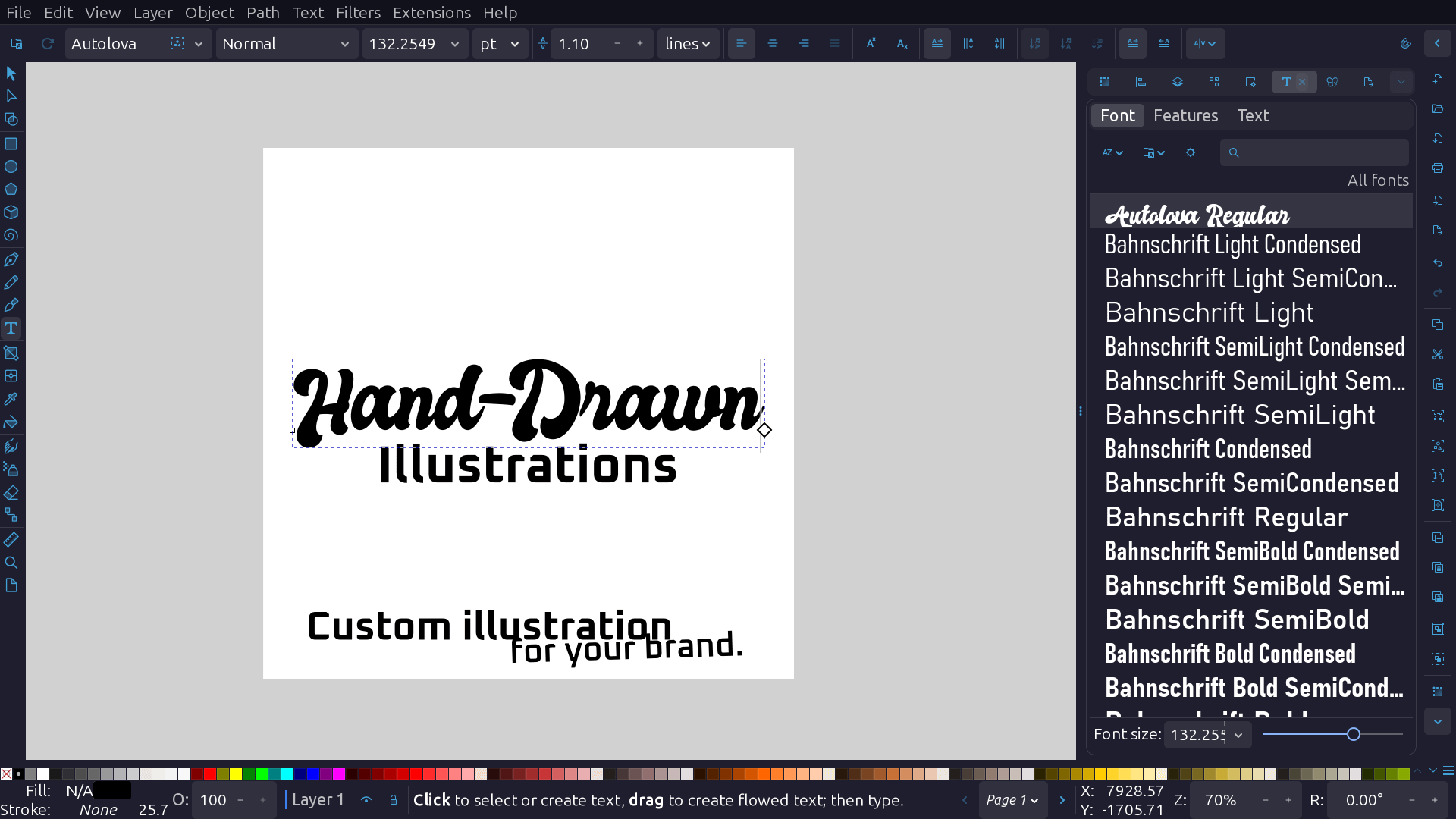
For the script font, I used Autolova. I paired it with Oxanium.
With the fonts in place, I moved on to color.
I chose to stack ‘Hand Drawn’ to make it bigger. I adjusted the right side of the H to curve over the top of the text. Using a bold shadow, I outlined the lettering.
For the background, I added some retro lines. Then I turned my attention to the illustrations.
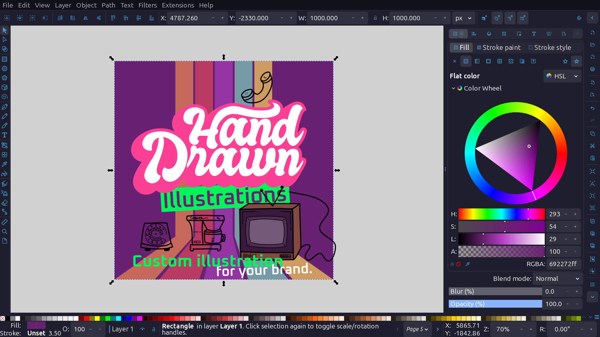
I traced the illustrations and placed them into the design. After coloring the TV, I wasn’t happy with the colors. So, I held off on coloring the other illustrations to explore different color palettes.
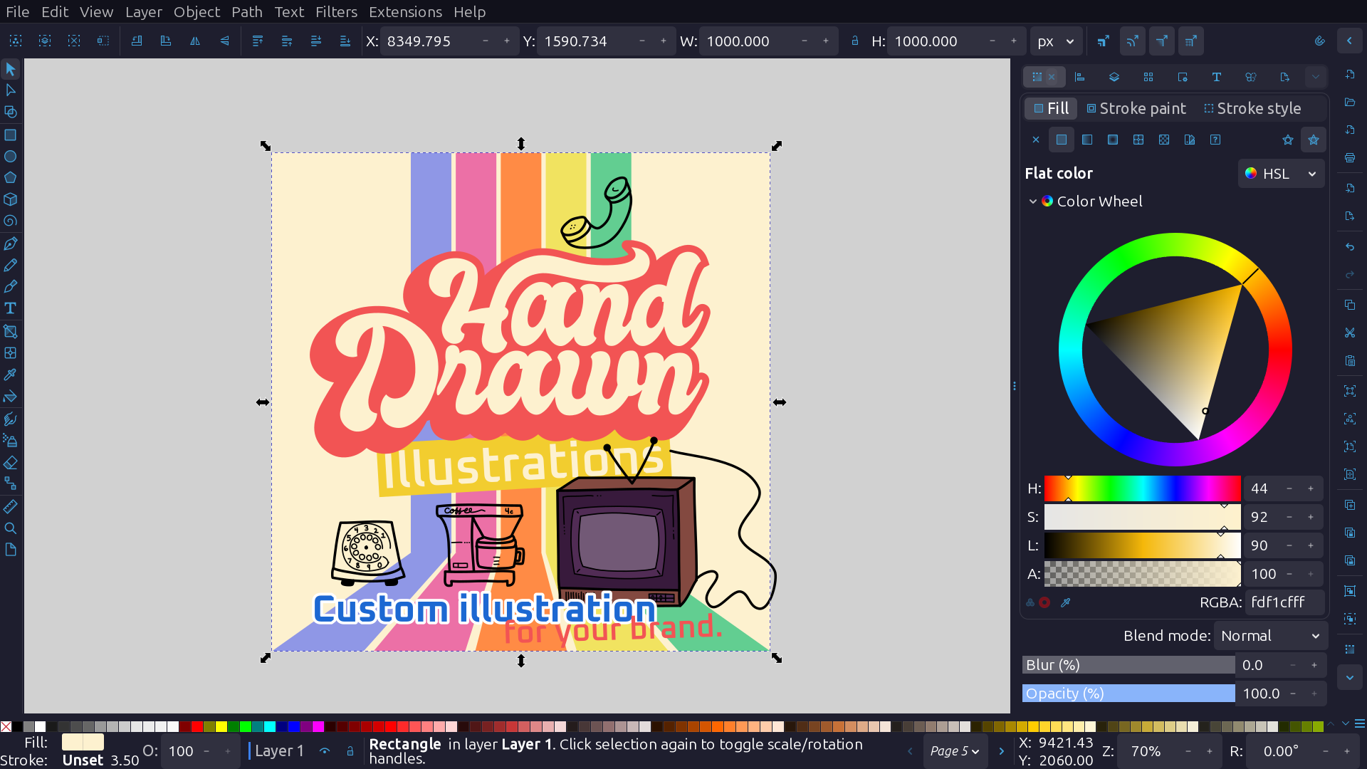
I liked the lighter background. However, this concept wasn’t coming together for me either.
There is always a part of the design process that is difficult—whether it’s a color, font, or layout choice.
I took a step back and tried a different means of getting that 3D look on the script type.
I duplicated the object three times and applied a different color to each one. Take two looked like this…
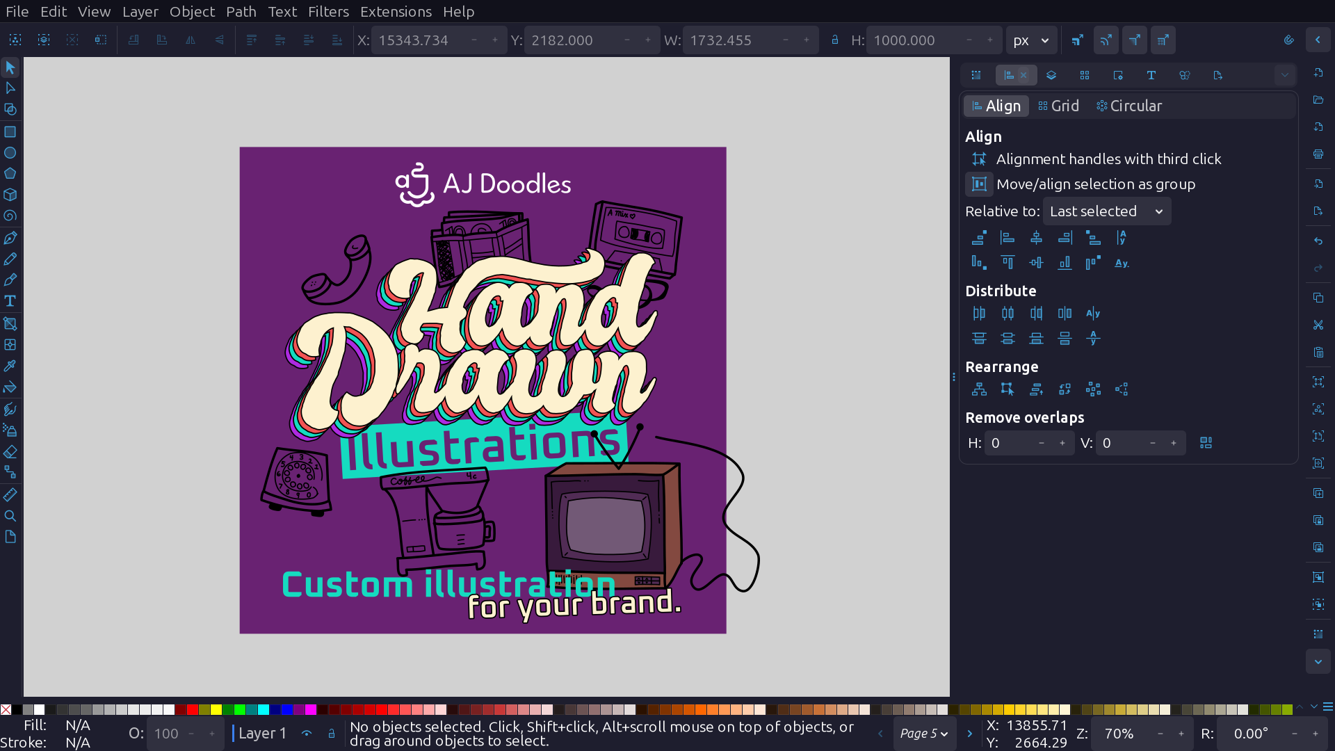
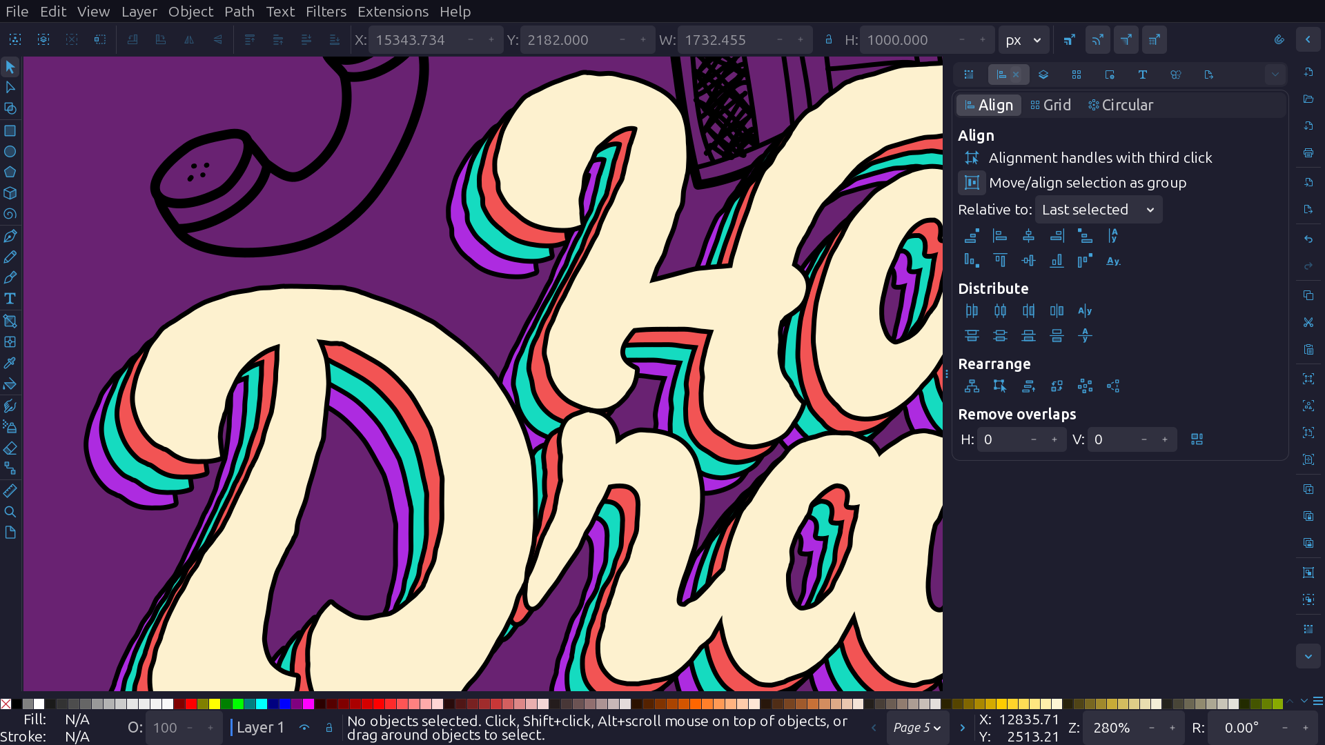
I distorted the text for an old-style effect.
Back to coloring the illustrations, I found this image on Pinterest.
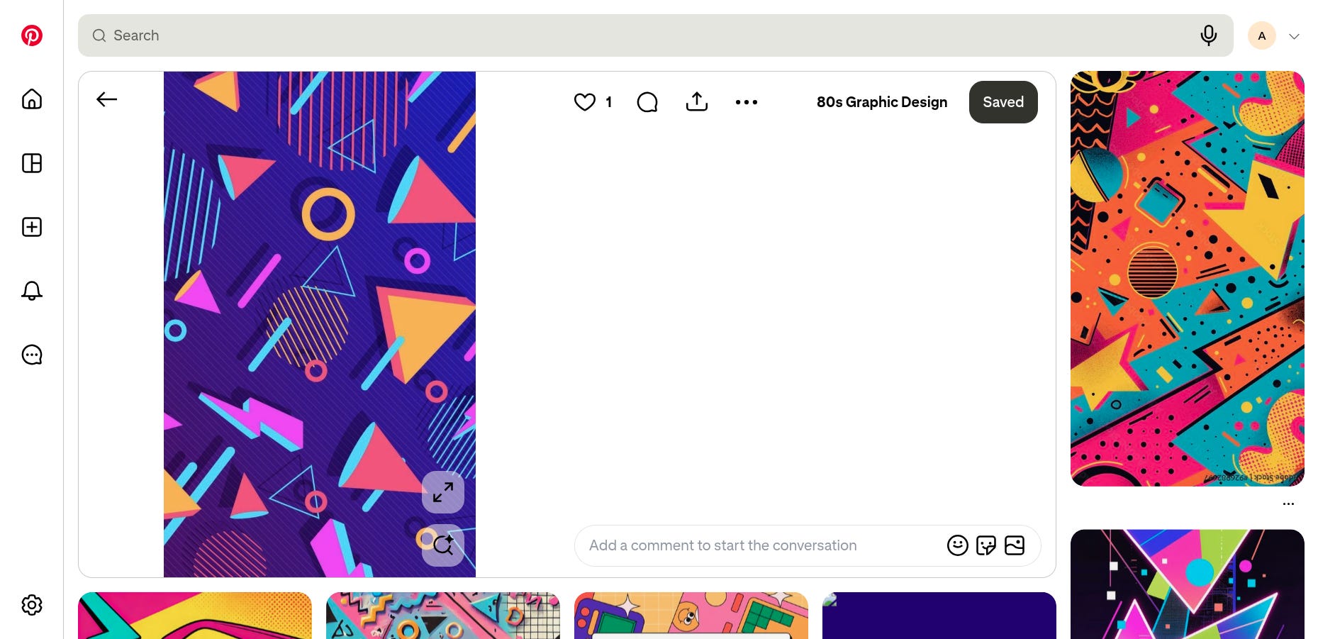
Taking the colors from this image, I added them to my design.
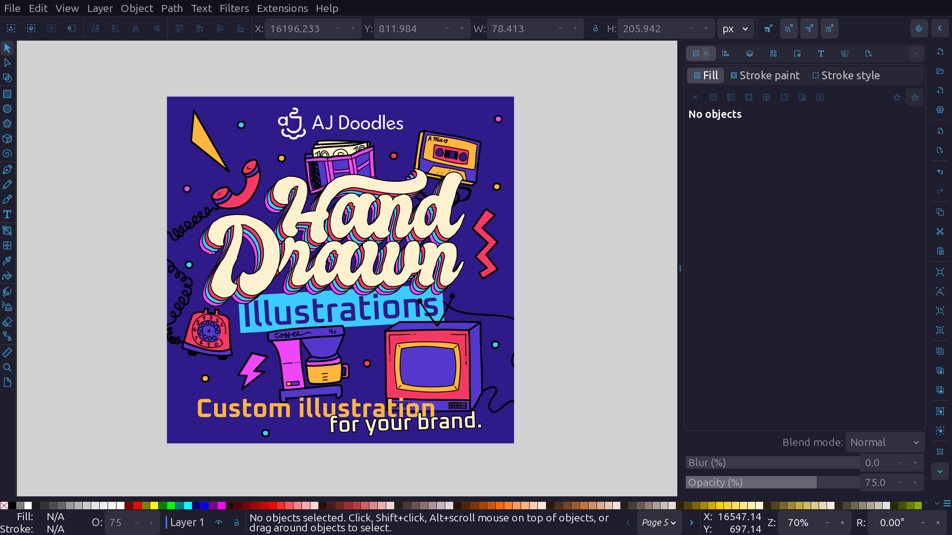
Finally, a color combination that I was excited about. Hold on, though, I wasn’t quite done.
To finish, I placed a halftone texture over each illustration (basically an image of several tiny dots). I offset the texture to give the illustrations highlights and shadows. This touch added lots of character.
The textures I use are sourced from texturelabs.org.
I then added a grunge texture over the whole design, which gave it an aged look. Then, I was done.
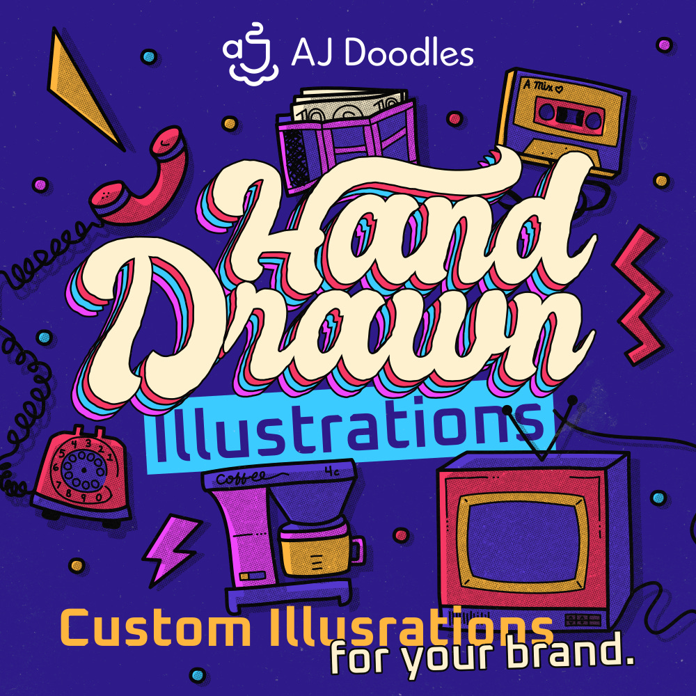
The result is a bold, vibrant, and retro-looking design that we can use to advertise our illustration services.
We had a lot of fun creating this.
Hopefully, this design will take you back to the 80s. If so, we accomplished our goal.
Custom Illustrations
How would you like a package of illustrations you could use across your branding?
Retro or not, we can create something just for you.
Are you interested in a quote for a design project? Fill out our intake form.
Stay tuned... next week we will create a design that takes you back to Y2K.
I’d love to hear your feedback and questions.
A real fun idea! The final project turned out great. As always, I'm amazed at the quality that goes into each illustration. 👏
One thing is for sure. You are working with some fun and creative ideas.
I look foward to the Y2K illustrations.
I like how you featured both Amy's doodles on paper -- coffee makers, wallets, etc. -- and Justin's digital designs from the 80s time period.
Great work.