

Y2K Really Happened! Graphic Designs That Tell the Story
Creating illustrated designs from the early 2000s


“It happened! Y2K Really happened!” My husband exclaimed.
Midnight came. The electricity shut down. We stood in the dark of our friend’s living room. Each pondered what to do next.
While my husband verbally processed, I looked outside and across the street to the neighbor’s home. Their lights were on; their trees were aglow with sparkling lights. Confused, I wondered, “Did it happen?”
Soon, the owner of the house and his co-conspirator ascended from the basement into the living room. They were laughing their heads off. We didn’t know they had slipped away.
They pulled a prank, especially hoping to get my husband, who was not so easily fooled. But they got him. They shut down the main breaker of the house. And for a few minutes, we all believed IT happened.
Today, we can say that Y2K happened, but not in the way they prophesied.
Computers didn’t shut down, and the economy didn’t collapse. Regardless, the world shifted. Everyone bought a personal computer and learned how to use it. We loved the phrase, “You’ve got mail.” We talked on mobile phones and danced to the music on our MP3 players.
These changes marked Y2K.
80s, Y2K, and 2020s Design Challenge
Justin and I decided to take a trip back to Y2K with our graphic designs. We wanted to look at design trends that marked the turn of the century, the millennium.
If you read last week’s post titled Back to the 80s, you know we’re challenging ourselves to make AJ Doodles ads from the 80s, Y2K, and the 2020s.
In today’s post, we’ll share the design process for our Y2K design.
Let’s get started.
We are a mother-and-son illustration team. Our drawings are hand-drawn and traced in the computer. Our goal is to help Substackers illustrate their publications with fun and simple drawings. We’re trying to restore the human creativity that is being lost from the progression of technology and AI.
Y2K Doodles
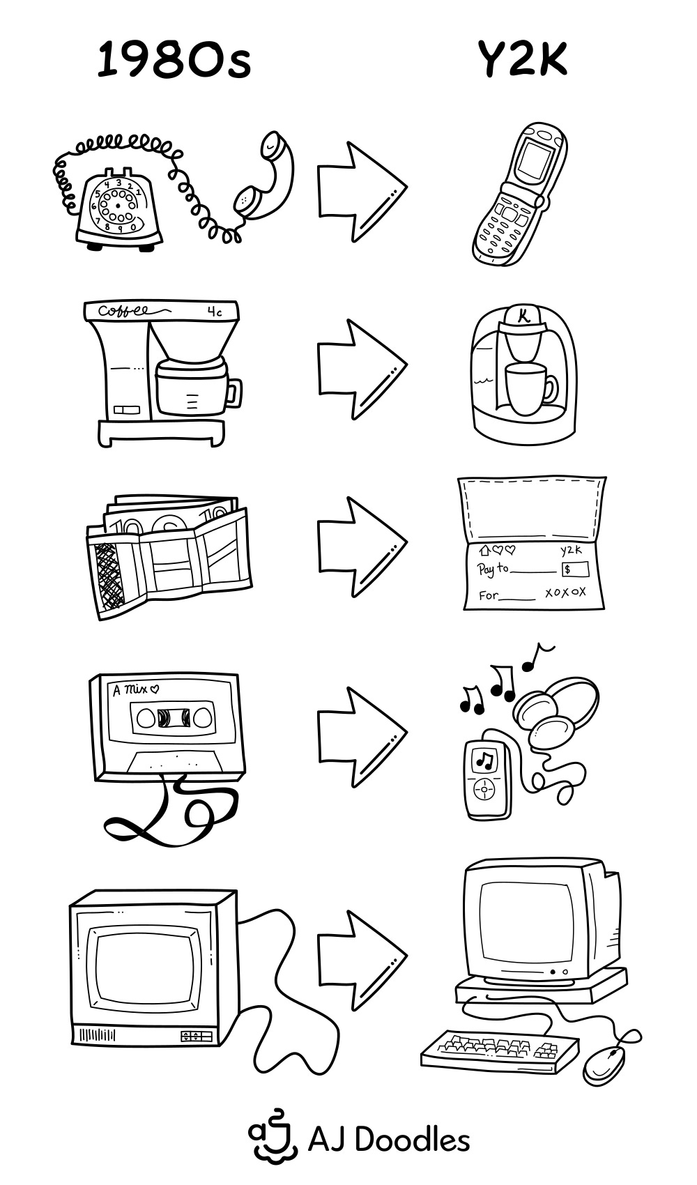
As with all our designs, we began with hand-drawn iconic Y2K doodles. Having already made doodles from the 80s, I picked out items that demonstrated progression. From Mr. Coffee to a single-serving Keurig, from a Velcro wallet to a checkbook, these directional changes show us where we were heading.
Here’s a look at the progression just using our doodles.
Finding Inspiration and Moodboarding
by Justin
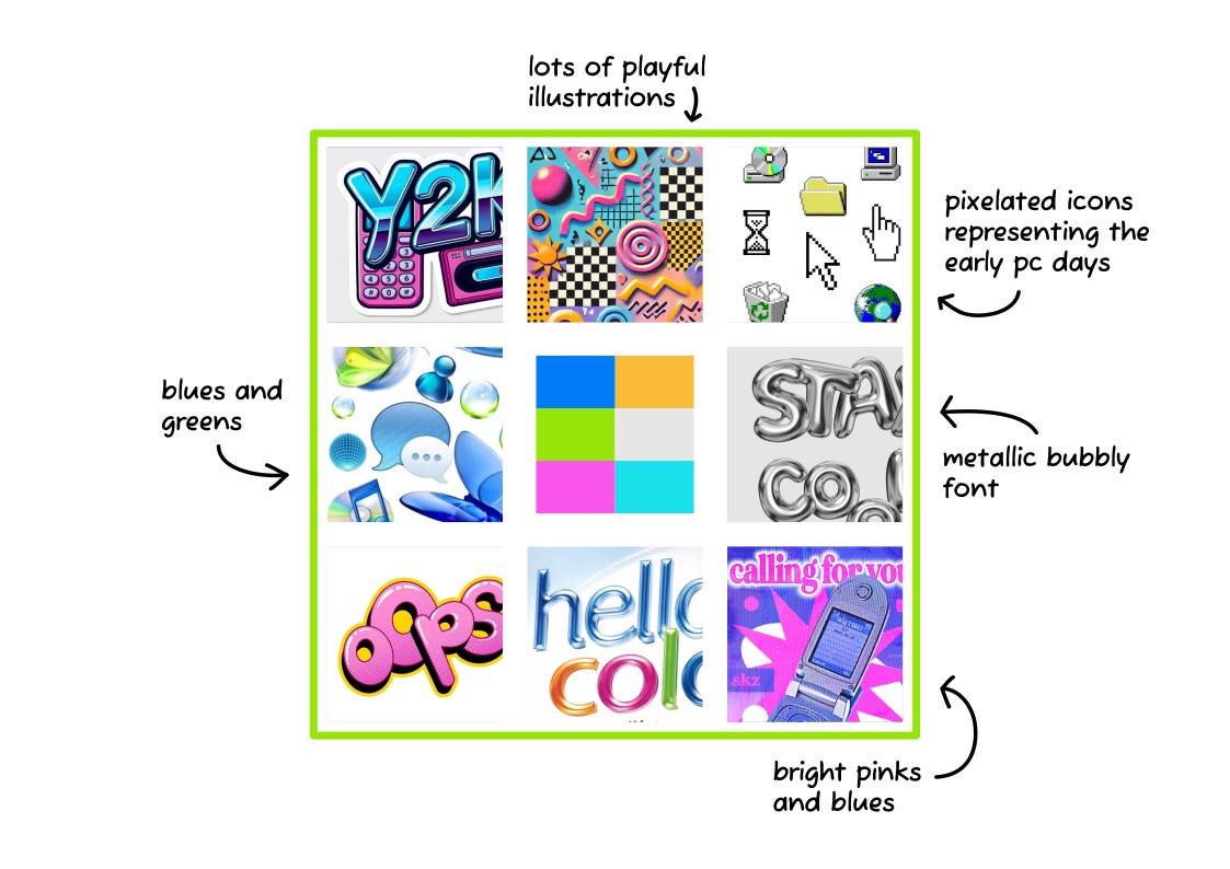
As technology became more capable, designers could create various effects more easily. Chrome gradients and bubbly elements became popular around Y2K. Other trends included pixel icons and illustrations, vibrant colors, and bold typography.
After spending some time browsing Pinterest, I put together a moodboard showcasing the style and mood I wanted to create for Y2K.
My Y2K Design
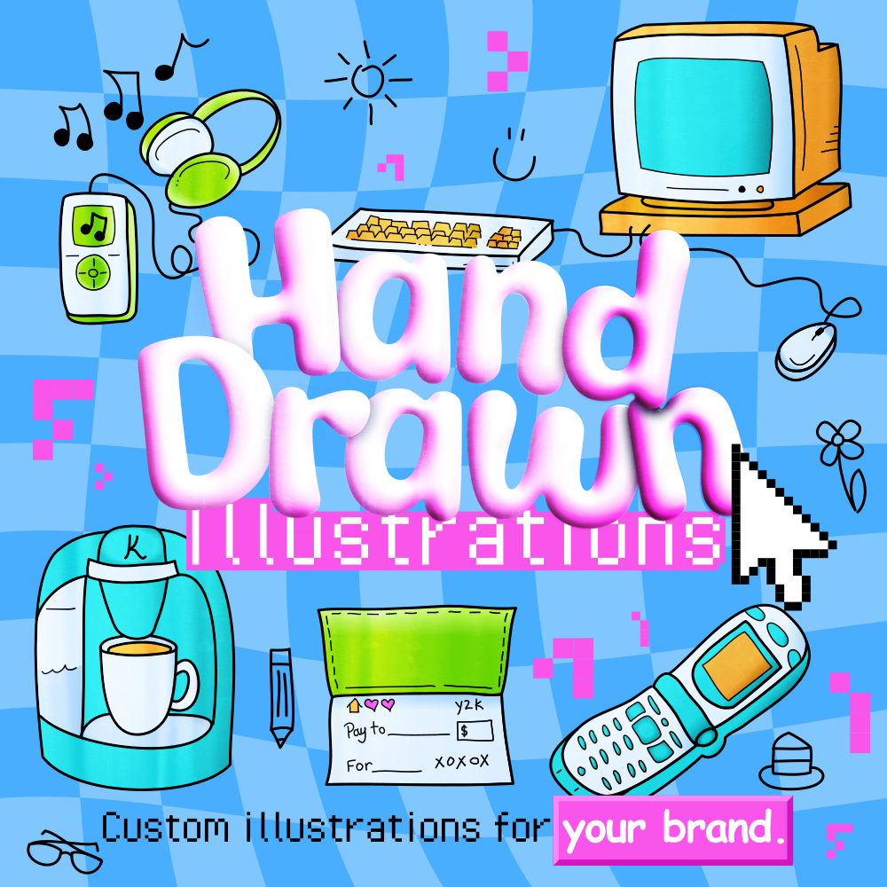
Instead of showing you each step of the process leading up to the finished design, I will start by showing the finished design first. Afterwards, I will walk through the process explaining the decisions I made.
Fonts and Typography
I wanted a bold and bubbly typeface for the “Hand Drawn” text. I found a font called Super Warming on dafont.com. I gave the letters a 3D bubble effect. Underneath, we have “Custom Illustrations” in a font called Pixel Operator. I used this pixel font to represent the early PC days.
Do you remember Cosmic Sans? This font was designed in ‘94 and became a staple of Y2K graphic design. Most designers, myself included, do not use it anymore. It has become outdated, which is exactly the look I was going for.
I used Comic Sans for “your brand.” I highlighted “your brand” with a pink button similar to the buttons of old computer interfaces.
Illustrations and Doodles
Moving on, I traced the illustrations in the computer. I used the bright colors I had previously picked out on the moodboard. I placed a chrome texture over each illustration for more depth.
After arranging the main illustrations in the design, I filled in the empty space with a handful of little doodles. I also added blocks of pixels around the design.
The Background
I had a few ideas for the background of the design.
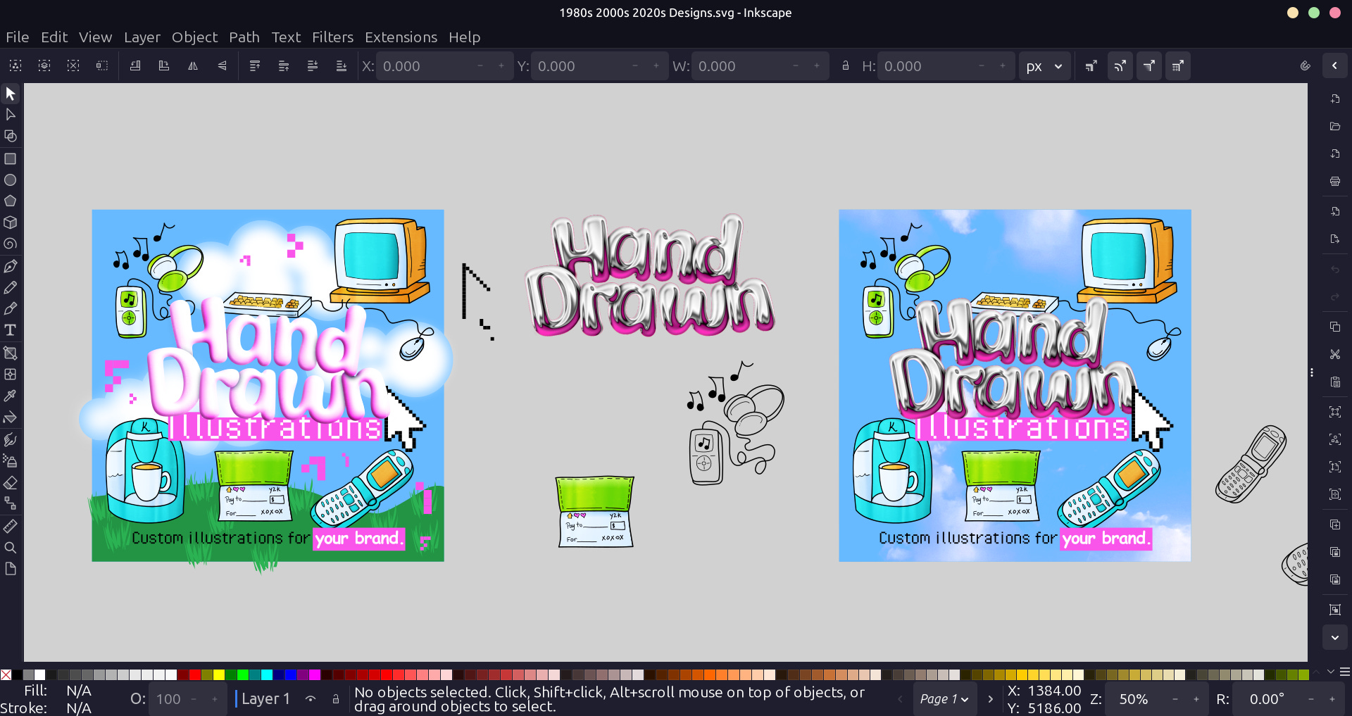
I wasn’t a big fan of the sky background. (It look a little too much like an Easter Egg Hunt.) So I made a checkerboard pattern and warped it. It’s not as complicated as it looks.
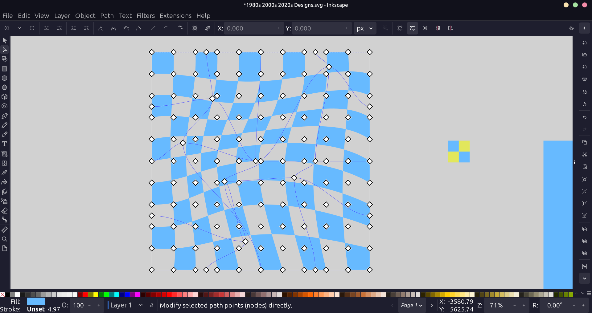
And with the background in place, I was finished with our Y2K ad design.
When you look at this design, does it remind you of the early 2000s?
Custom Illustrations
Are you ready to take your brand to the next level?
We create hand-drawn illustrations that are vibrant and playful. If you’re interested in working with us to give your visual identity a makeover, fill out our intake form.
We’ll work to create any vibe you’d like.
“I enjoyed my experience working with AJ Doodles and love the final product. They took my preferences and used their creativity to create a fun, colorful expression of Simply Harmony Coaching.”
As usual, we’d love to hear your thoughts on this design. If you have any questions, ask them in the comments.
My favorite part was seeing the image where you compared the phone, coffee maker, wallet, etc., from the 1980s to Y2K. It was a very unique and playful spin on things.