Creative Ways to Design Substack Images Using Doodle Art
Want to download an illustration package for free?
Share the package with your friends. If they buy it, you’ll get 25% off; they will too. If 2 friends buy, that’s 50% off for you, and 25% off for each of them.
If 4 buy it, that’s 100% off for you! So why not?
If you follow AJ Doodles, you have seen many doodle art images. Up to this point, all my designs have a ‘digital art’ look.
Digital art is great. It’s vibrant and fits in well with Substack publications. If you like it, use it!
But you are not constrained to this look. With a little creativity, our doodles can be used to enhance real photos.
In this post, I will show some examples.
From two generic stock photos, I added a touch of personality with our doodle art.
The pictures used were sourced from Unsplash. Unsplash has a large library of royalty-free images. To create images for yourself, I recommend browsing their collection.
What software will I use? Inkscape and GIMP. They are free and open source tools. Inkscape is ideal for graphic design and illustration, while GIMP is used for editing and manipulating photos.
Without further ado, let’s take a look at the first style…
Classroom Chalkboard

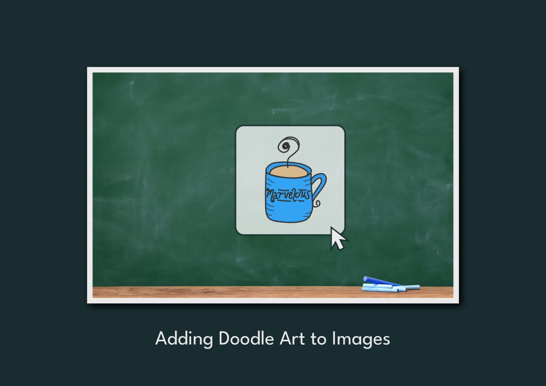
Chalkboards are light-hearted and playful! They create a classroom feel, preparing your readers for the lesson they will learn.
Let’s say this featured image is for a productivity post.
After some color adjustments, I added the text. For the font, I chose Fuzzy Bubbles.
I designed the wording in Inkscape, adding spaces and rotations to make it feel hand-drawn.
To emphasize “Writers,” I underlined the word. Can you see your English teacher with chalk dust all over his hands, underlining this message to the aspiring “Writers” in his class?
In GIMP, I placed the lettering on the chalkboard. To give it the chalk look, I added noise. This makes the pixels have multiple shades of color, not one solid color, giving it a realistic look.
I then added a spread effect. This spreads the pixels of the lettering, giving it a grainy look.
I edited the color curves to blend the letters in with the board.
Okay, now for the doodles. They will turn this design from a bland, boring classroom to a “let’s have a good time learning something new” feel.
I added the same filters to the doodles as I did to the text.
What I like about this design:
It was easy to create.
It’s simple and not overly crowded.
It’s fun and unique.
It prepares the reader for a lesson.
It doesn’t look AI-generated.
Notebook and Stickers
For my second design style, I created an image from this notebook.
Notebooks are personal. An open notebook makes the reader feel like they are getting information straight from your journal.

An empty notebook, however, is uninspiring and can feel intimidating. So, we need to fill the pages to invite the reader inside.
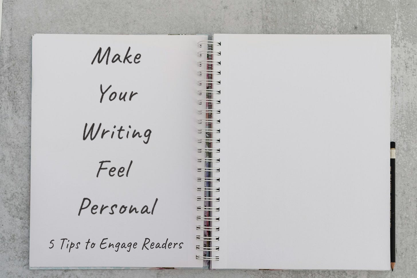
The post is tips to make your writing feel personal.
I used the Caveat font.
To make the writing blend with the paper, I adjusted the color curves. I also added a spread effect to make it look like pencil writing.
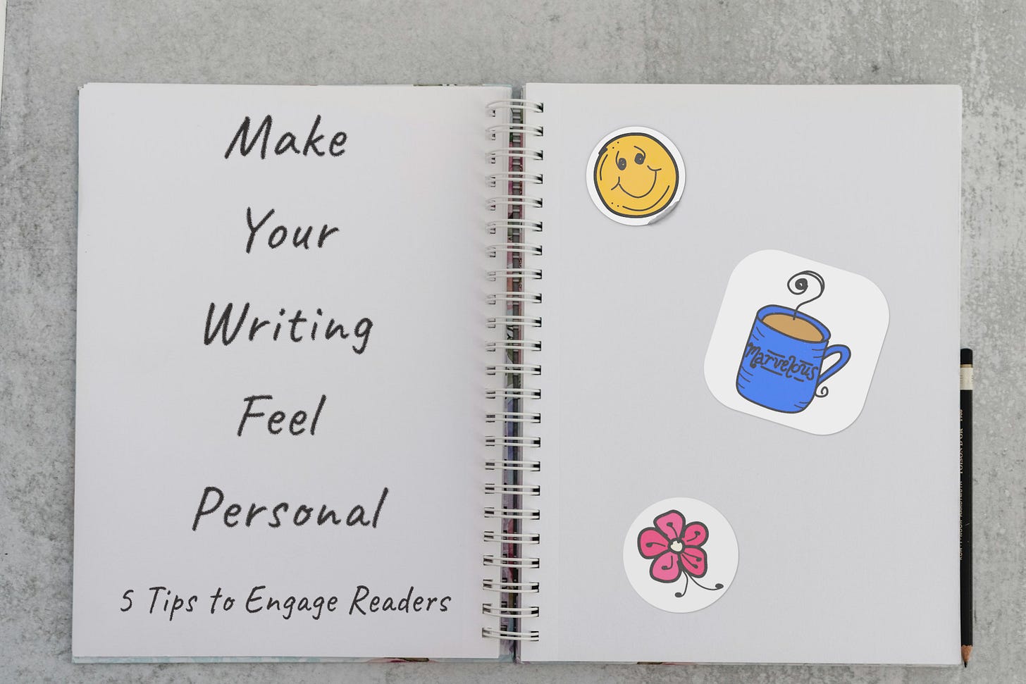
I reserved the other side of the page for doodles. I had some fun and created stickers using our doodles.
These stickers transform this notebook into something even more personal and welcoming.
In Inkscape, I started by coloring and adding a white background to the doodles. I then imported them into GIMP and added a drop shadow and texture.
Of course, I had to adjust the lighting on the stickers to make them blend in with the image.
The smiley face sticker is starting to peel away from the page.
What I like about this design:
It feels personal, which is what the post is about.
It’s calm and simple.
The text clearly explains what the post is about.
The stickers help illustrate the idea of intimacy and engagement.
It doesn’t look AI-generated.
More Ideas Like This
If you like this post, stay tuned.
Next Friday, I will share 2 more design styles using images similar to these.
Subscribe, so you don’t miss out!
Okay, before you go, I want to ask a quick question.
Any questions? Comment below. I’ll respond to every comment.


Love this, Justin.
I’ve felt that same thrill of turning something ordinary into something that feels alive.
What stood out to me is how structure fuels creativity—clear steps, simple tools, consistent style.
Love both the chalkboard and notebook expressions, Justin.
Thanks for sharing. Really creative!