

How to Make Substack Images with Patterns
An In-depth Guide to Creating Great Designs

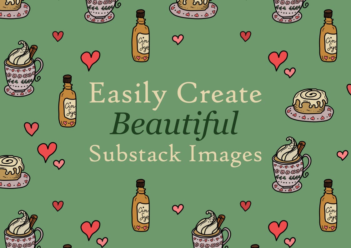
Would you like to learn how to design a featured image like this?
First, let’s talk about why this design works.
The words are readable. Readability is a must in graphic design. Someone scrolling through your publication should be able to read the image in a couple of seconds.
The doodle art supports the text. The doodle art doesn’t take all the attention away from the text, but it supports it and helps draw the eye of the reader to the text.
It is simple, yet fun. Modern design is simple. Sometimes, simple can be boring, but this design is interesting and unique.
If you are new to graphic design, this is a great way to design your images.
Now, let’s talk about how you can get started.
4 Steps to Design a Post Image from a Pattern
1. Select a Pattern
Start by choosing a pattern.
If you like the doodle art style, we have a pattern bundle. You can select patterns from the 12 patterns in this bundle.

2. Size the Document
Open the pattern in the design tool of your choice (Canva, Illustrator, ProCreate, Inkscape, etc.)
Size the pattern as needed. I usually use A4 landscape (210 mm by 297 mm) as a default for Substack post images.
Depending on where the image thumbnail is, part of the design might be cut off, so it is important to have a good margin without any text.
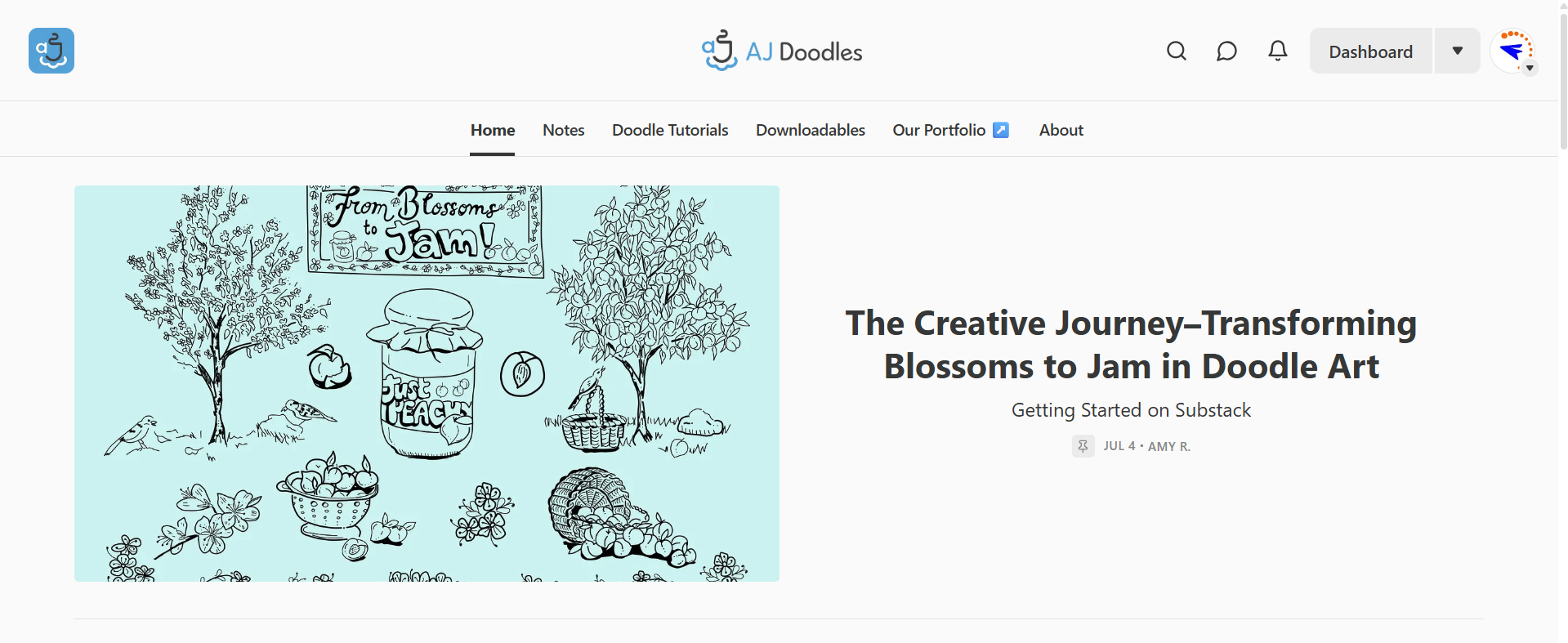
For example, the featured image below is cut off, but when you open the article, you can see the whole design.
3. Add Text
Use a clear, readable font. The font should match the branding and tone of your publication.
Enter a simple, straightforward phrase related to your article. This isn't necessarily the post title; it can highlight the main topic the post covers.
Place the text anywhere you like. It can be center aligned, left, right, top, bottom—anywhere.
4. Remove the Pattern Objects Under the Text
Okay, once the text is in place, it’s time to remove any objects in the pattern under and around the text.
I use the pen tool to trace around the objects I want to remove. Once I finish tracing, I color the space the same color as the background of the pattern. Then I move the text to the top of the design.
That’s it. It is easy and a great project for anyone with little to no experience designing.
Here’s a video of me using the steps above to design an image.
6 Tips for Designing Your Next Post Image
When choosing fonts, consider font psychology.
If you want to learn about font psychology, read this Medium article.
Stay on brand with your font choices. If you have a dominant font that you use in your designs, go with that.
Pick two fonts that pair well. Use the main font to type in the majority of your text. Use the other font to type in a small portion of text that you want to stand out.
Make the type big and readable.
Select font colors that contrast with the background. Sometimes I will make the text color the same as an object in the pattern. Other times, I will find a color that makes the text stand out better.
If you're having trouble picking a good color, try using Coolors. Enter the background color and a few other colors into the pattern, lock them, and see what additional colors are suggested.
For a detailed guide on Coolors, check out this post.

Examples of Images I Have Designed
Okay, now that we’ve got the technical stuff out of the way, let’s look at some of the designs I have created.
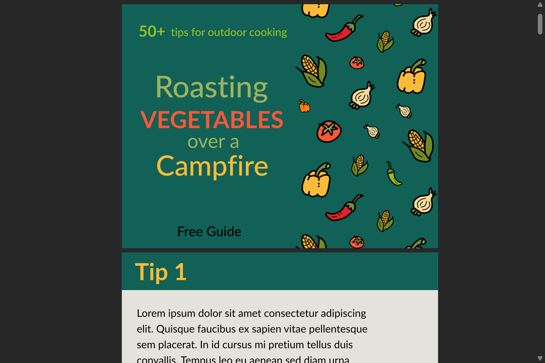
In this example, I created a PDF cover design using a pattern. I only used the pattern on the right, and I placed the type on the left.
The text includes several of the colors from the vegetables. The design has good visual hierarchy, as the most important details stand out.
Patterns are a great way to design PDF documents for a lead magnet or a course for your Substack publication.
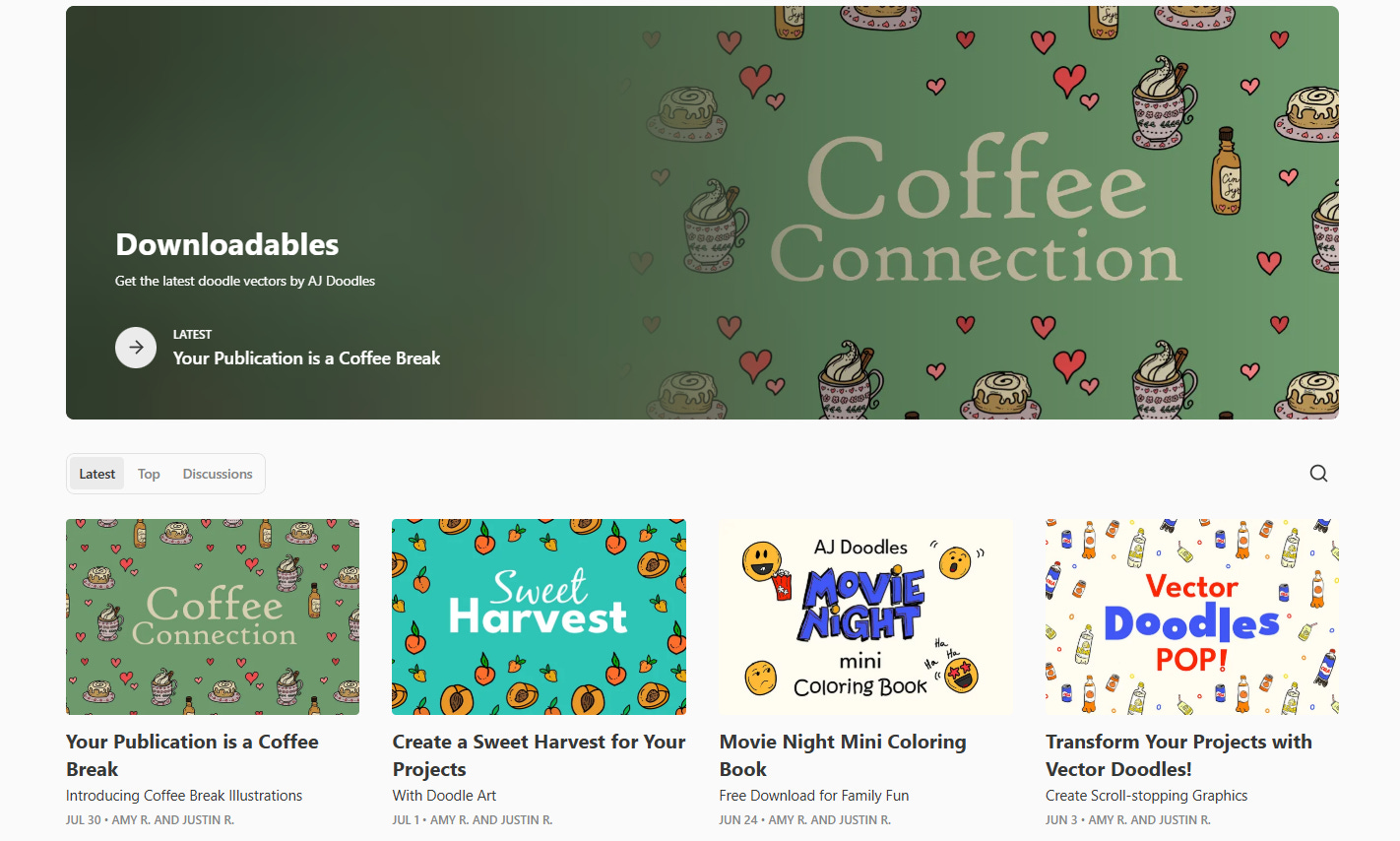
This is the Downloadables section on our publication.
Here you can see that the most recent images, except for the coloring book, were all designed with the pattern method.
Using the same style of patterns, you can achieve a consistent look without boring your audience. Different colors and fonts were used, and yet they all harmonize. This brings visual consistency while giving each post the attention it deserves.
Finally, we designed our profile banners using the pattern method.
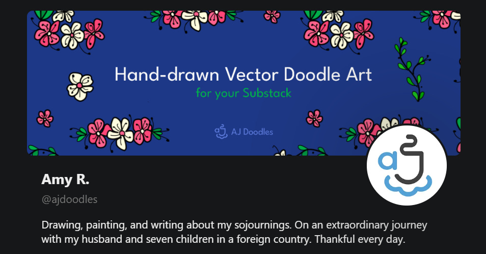
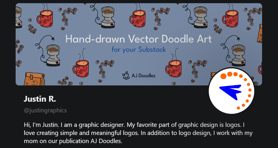
These banners work great because they clearly state what we provide here on Substack. The text is supported with doodle art, making the banner look fun, unique, and personal.
We would like to help give your Substack profile a personal and inviting banner.
If you would like a banner designed for you with our doodle art, check out our Personalized Hand-drawn Illustrated Substack Profile Banners.
Give It a Try!
That’s it.
How to design images from patterns
Tips for creating a great design
And examples to inspire your creativity
Now it’s your turn to open up a design program and get started.
If you love the fun doodle art style, be sure to take advantage of our Doodle Art Pattern Bundle launch sale.
50% off until Tuesday, August 12.
Let me know in the comments, do you like the doodle art pattern look?
If you have any questions, be sure to ask them below, and I’m happy to help you.
This post seems like it took a long time to build with a lot of thought and care.