

E-Book Cover Design Process (From Concept To Clickworthy)
Case study and tips for designing an exceptional book cover

When I look at a book, I definitely judge it by its cover.
I can’t help it. I’m a designer. I see bad designs and I analyze what I would do differently. Would I change the colors? What fonts would better suit this project? 🤔
It’s not just about what I like. It’s about the viewer. Potential readers may be turned off to a poorly designed book cover. They may not understand why a design is bad. Never the less, a bad design communicates something to the reader.
Three Keys to the Best Book Covers
The best book cover designs have these three things going for them:
Simplicity: The simpler the better. Book covers shouldn’t be overly crowded with elements. They shouldn’t have multiple flashy colors. At least not in most cases.
Clarity: A book cover needs to give potential readers clarity. It should express what the book is about. It should give the viewer an idea of what they’re in for if they choose to read the book.
Emotion: Every design evokes emotion. Bad designs evoke the wrong emotions. Good designs hit the right emotions.
If the book is a mystery/thriller, the elements need to portray a mysterious feeling. This could be done by using dark shadows, minimal color, etc. If a book is fantasy or adventure, the colors should be bright and playful.
In this post, I’m going to walk you through how I designed a book cover for Jordan. I attempted to hit the above three points when I created it.
Jordan’s New Book
By Jordan
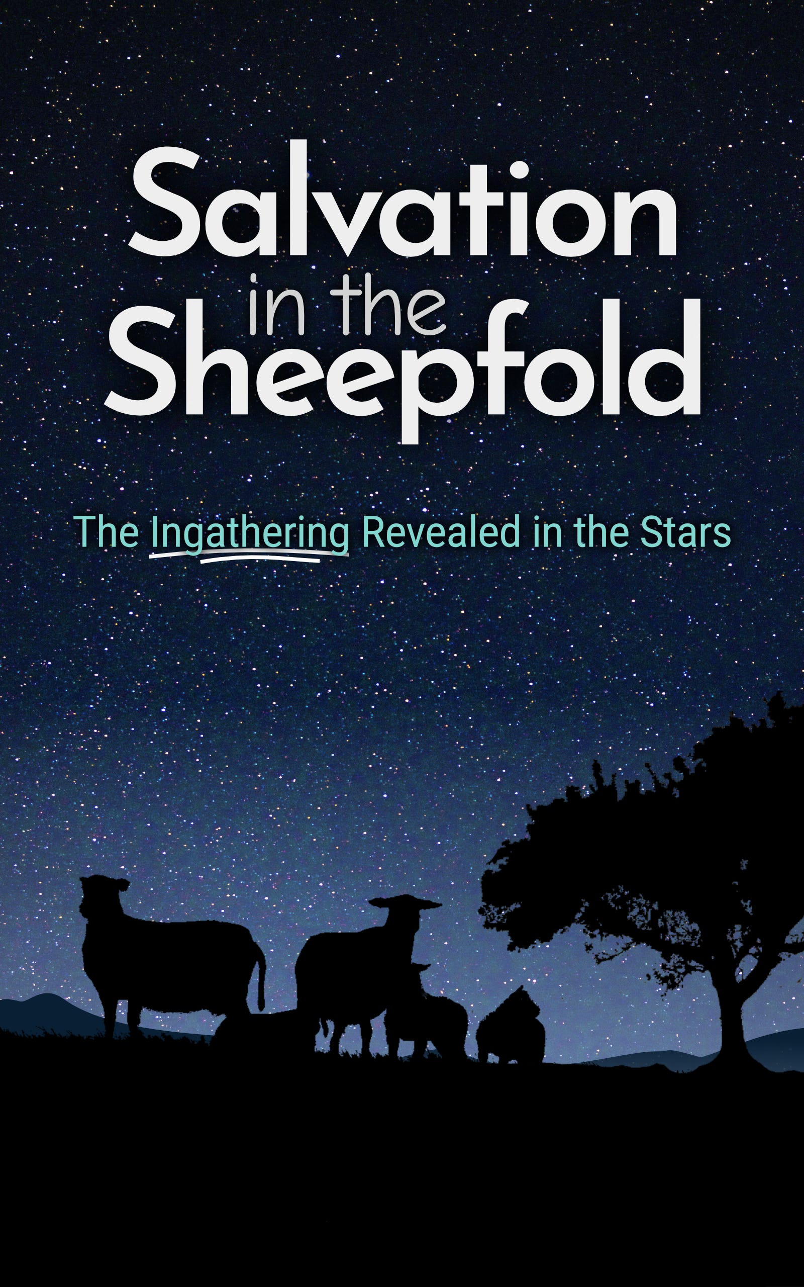
My book is titled Salvation in the Sheepfold: The Ingathering Revealed in the Stars.
The constellations prophesy a gathering of God’s people in a protected place before the return of Messiah. Together, biblical prophecy and the pictures in the constellations reveal a plan to save a remnant of humanity. This book is a scriptural study of the following signs in the Heavens: the Sheepfold, Twins, Good Shepherd, Breaker, and Messiah’s Bride.
You will be amazed at what is written in the sky for our generation.

We are a mother-and-son illustration team. Our drawings are hand-drawn and traced in the computer. Our goal is to help Substackers illustrate their publications with fun and simple drawings. We’re trying to restore the human creativity that is being lost from the progression of technology and AI.
First Concept
Jordan and I had a clear vision for a silhouette of sheep on a dark, starry night background. So, I worked on this concept.
After browsing for a while, I picked these three pictures from Unsplash.


Using the sheep and trees, I made a silhouette.
I adjusted the colors of the starry background. This made the silhouette clearer. I then added the title and subtitle.
For the fonts, I chose the same fonts Jordan was already using in his branding and designs: Josefin Sans and Roboto. I also used a hand-drawn font, Comic Neue, for the “in the” part of the title. This font pairing gave the title some visual interest and added a human touch.
So far, this design was definitely simple. I didn’t add any extra elements. If anything, it was bland. Through the revisions, I dealt with that problem.
Designers need to put themselves in the shoes of potential customers. I thought about what would interest the viewer. What words would help them understand the product? It’s the thought process that makes a design good.
I underlined “The Ingathering” in the subtitle. This part is key to the viewer, as it is the primary concept discussed in the book.
I didn’t make a perfectly straight underline. Rather, I created a curved line. This paired with the handwriting font used in the title.
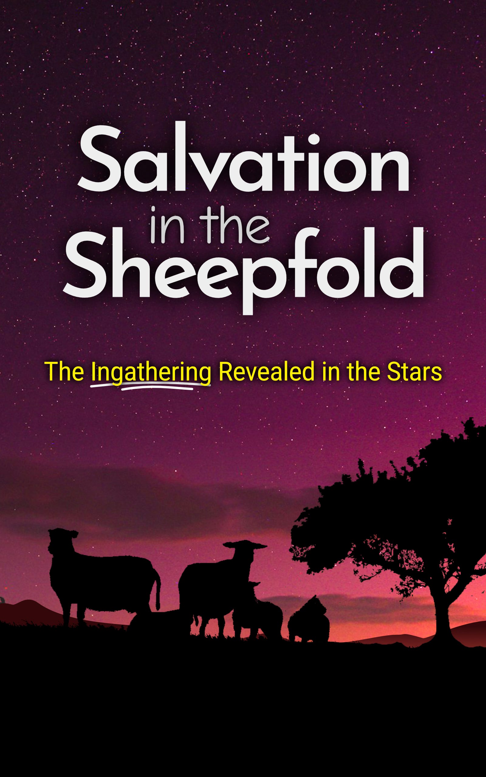
Jordan and I liked the concept, but we both felt that it looked too similar to his other book cover. We wanted it to feel cohesive with his other book but also stand out on its own.
Second Concept
To change things up, I found this photo on Unsplash for the background. The colors are distinct and add a sense of intrigue. The sky still shows stars, which was pretty important given the book is about stars and constellations. 🌟

After adding the background colors to the design, I adjusted the colors. And with that, the cover was coming together—stunningly!
The Finishing Touches
Everything was looking really good. We liked the color change. That deep red/purple was vibrant.
Now, it was time to put on the finishing touches.
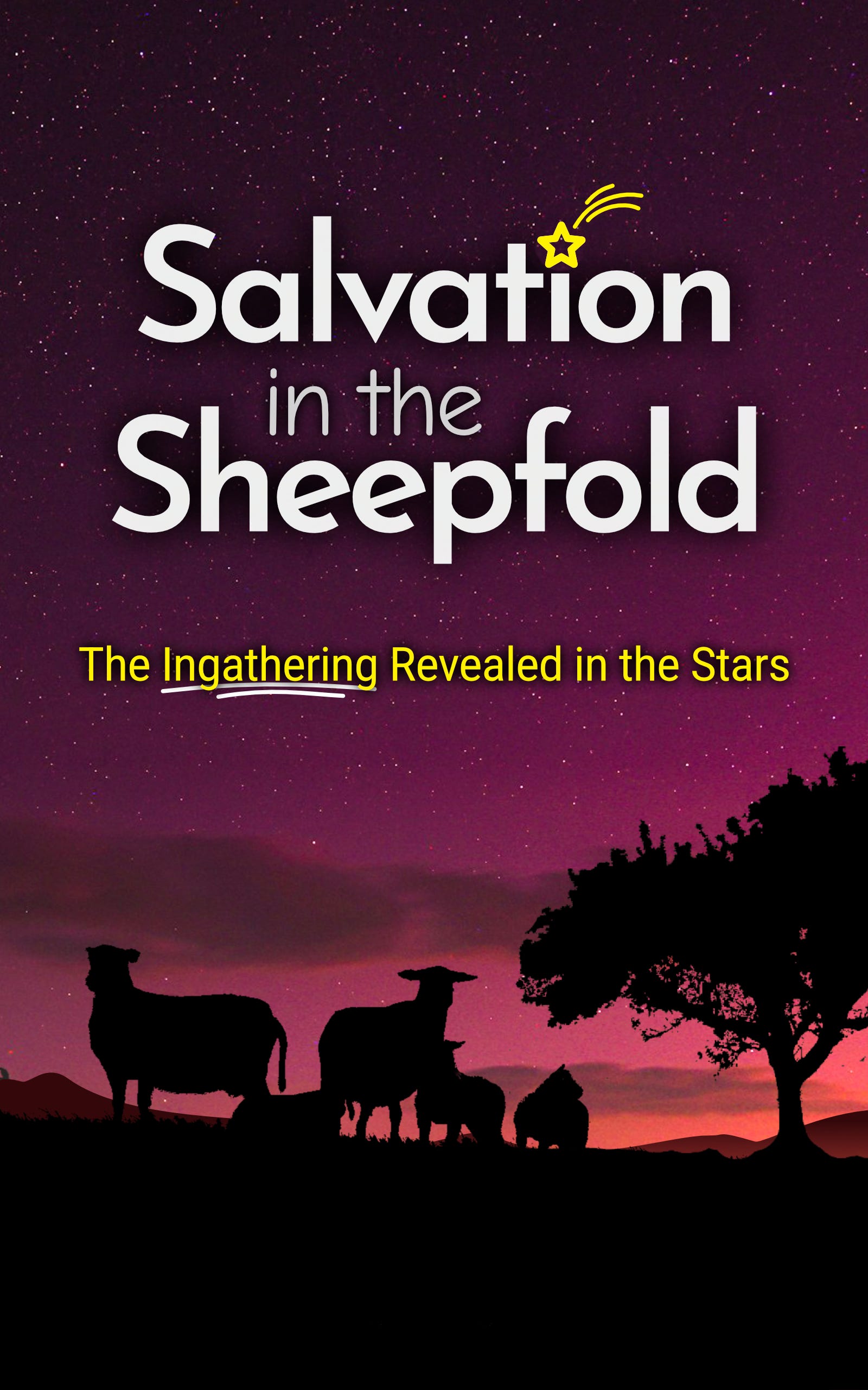
To add a little extra character, I replaced the dot in the ‘i’ of “Salvation” with a star. 🌠
A little illustration on a book cover can work really well.
Finally, through the colors and the star illustration, I made a bold and lively vibe.
Jordan signed off on this design.
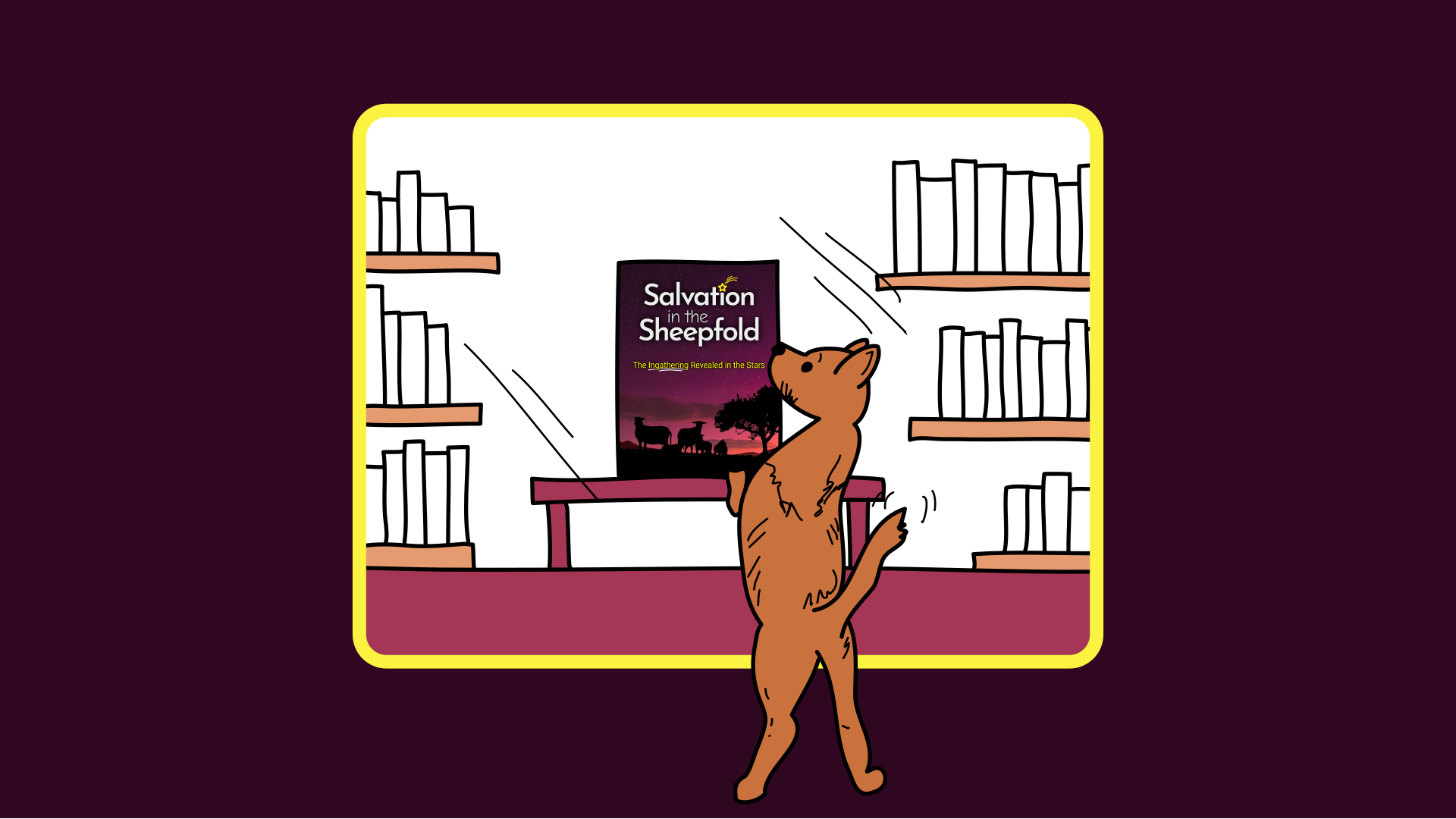
Ad Designs for the Book
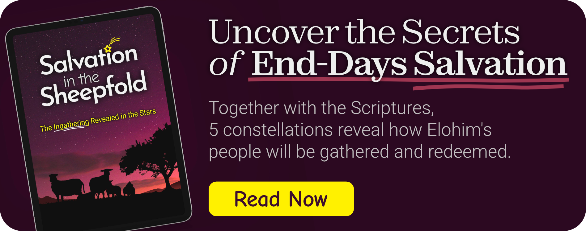
To help Jordan promote his book through his Substack posts, notes, and emails, I created a couple of ads.
I used the same colors that were used in the book.
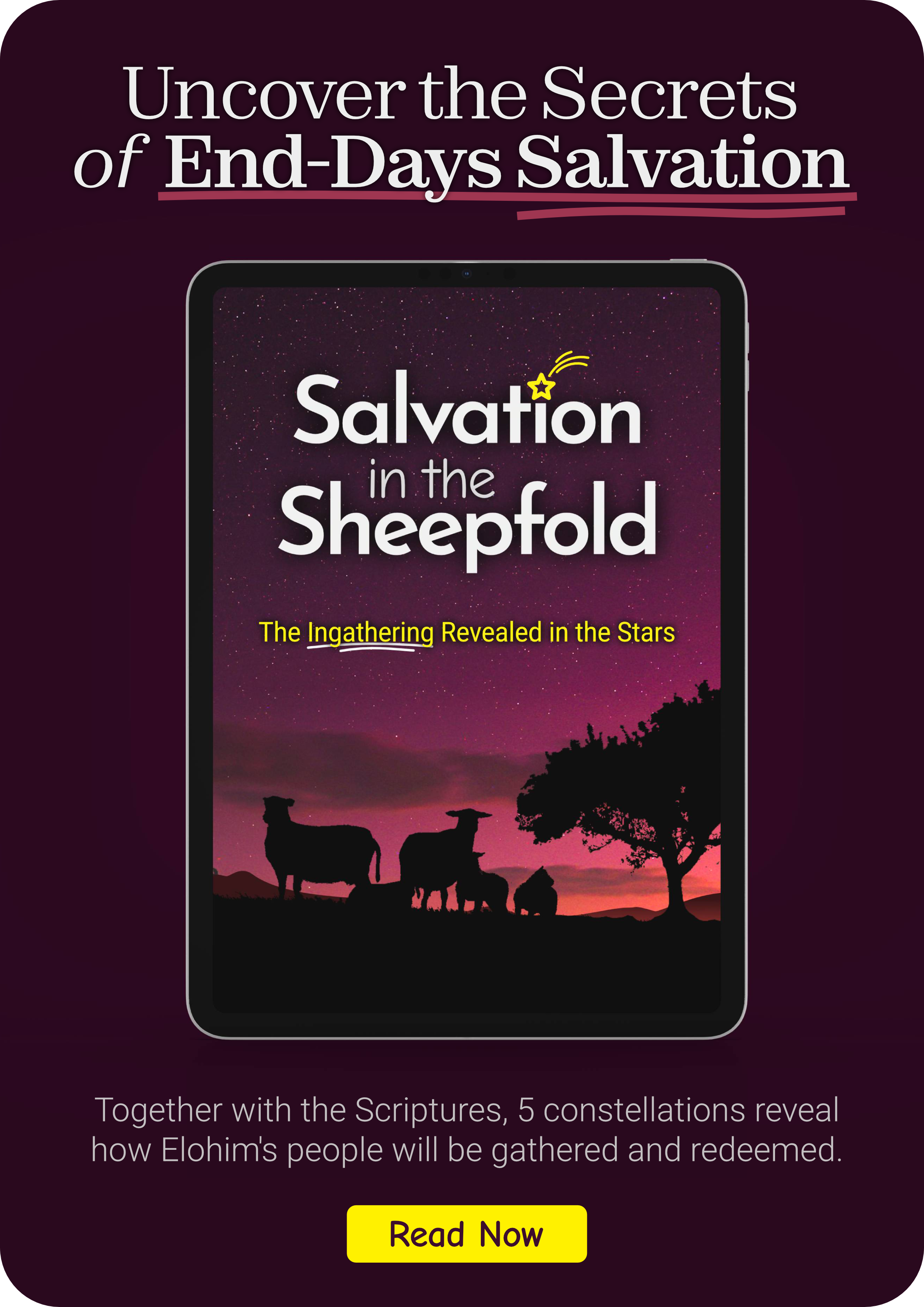
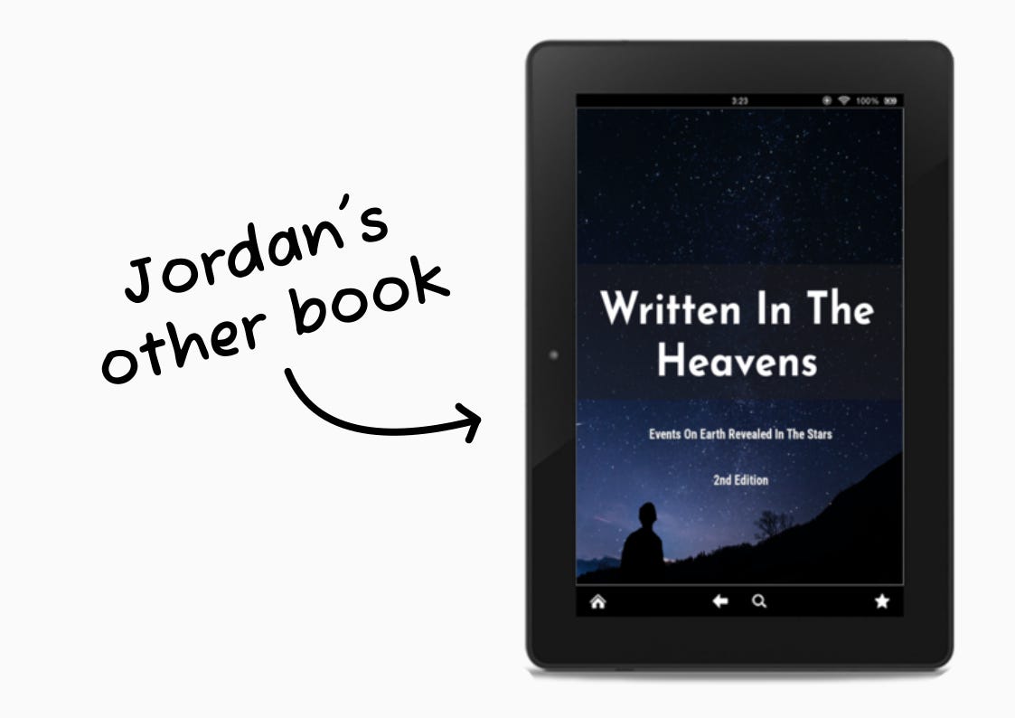
I made a mock-up of the cover design on a tablet to show that it is an e-book. For the fonts, I wanted one that was quite different from the sans serif typefaces on the cover. I found a serif font called Zodiak. Not only did it pair nicely with the other fonts, the name Zodiak fit well. 🙂
I gave Jordan a smaller version of the ad in case he wanted something that takes up less space.
Here’s what Jordan said about the design:
AJ Doodles did a fantastic job with my cover.
Amy brought vision to the project. She was careful to include my preferences while bringing her own touch. Justin did a great job executing the illustration. He made sure I liked how things were forming before moving forward. Justin went above and beyond to highlight what was important to me.
I love how the shooting star in the “i” of Salvation draws extra attention. The gradient colors of the dusk sky fading into the starry night adds interest. Most importantly, the flock of sheep gathered under the night sky communicates my message. All in all, this book cover suits me perfectly. Amy and Justin worked with care and professionalism.
Are You Publishing A Book?
If you are writing or publishing a book, we’d love to help you create a unique cover design. Something that feels like your writing and makes your book standout.
I’d love to hear your feedback on the design.
Love the examples! If I ever write a book I know who to contact for a cover!
That book cover makes me so excited to use your services for my upcoming book. 🙂